Responsive newsmag layout in 10 lines of CSS3
By combining multicolumn layout with page floats, some amazingly beautiful, scalable and responsive pages can be built. This page shows screenshots from Opera's WebKit-based implementation, along with links to the actual HTML page. The CSS code is very simple: each of the sample documents below use at most 10 lines of CSS code *. No media queries are used to achieve the effects showcased. The images show the same HTML document in various viewport sizes. Notice that there are no scrollbars. Instead, pages are discrete and user move from one to the next with a finger/mouse/pgdn/pgup. It's time to paginate the web.
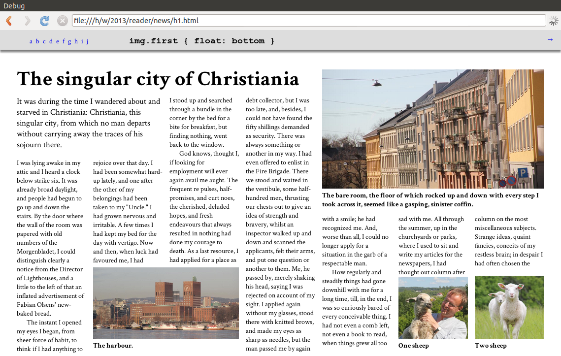
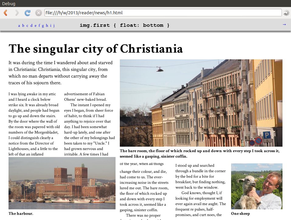
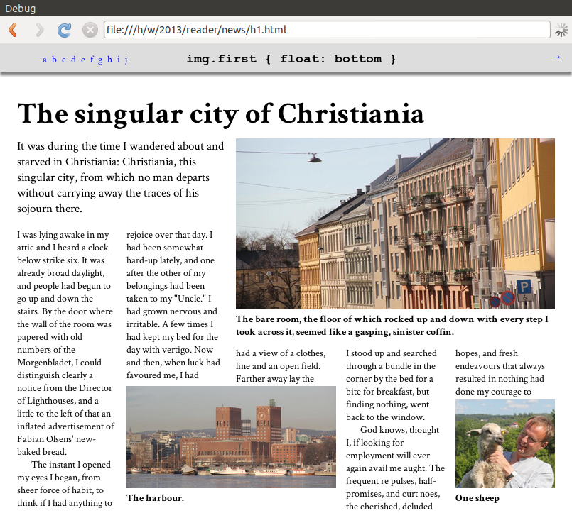
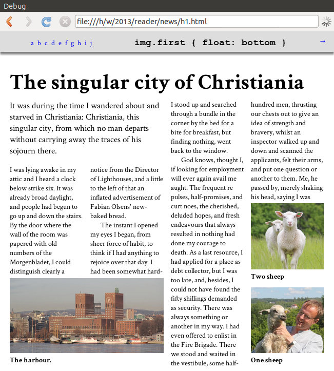
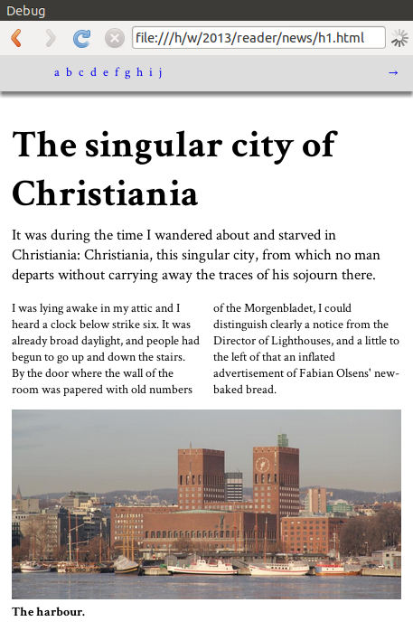
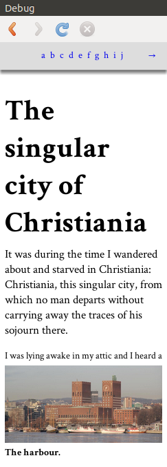
On this page, a basic multicolumn layout has been adorned by text and image elements that span several columns. Also, the images (along with the textual description) float to the top and bottom of the page. Notice how the images move to the next page(s) as the size of the window gets smaller. The number of columns also decrease. Here's the code:
body { overflow: paged-x }
article { columns: 10em }
.lead { column-span: 2; float: top }
h1 { column-span: 4; float: top }
.fig { column-span: 2 }
.fig img { width: 100% }
.first.fig { float: bottom }
.second.fig { column-span: 3; float: top-corner }
.third.fig { column-span: 1; float: bottom  }
PDF version can be generated Prince and AntennaHouse from a prefixed version: landscape, portrait. The prefixed version also works in Opera 12. The test case is inspired by a real-world newspaper article.
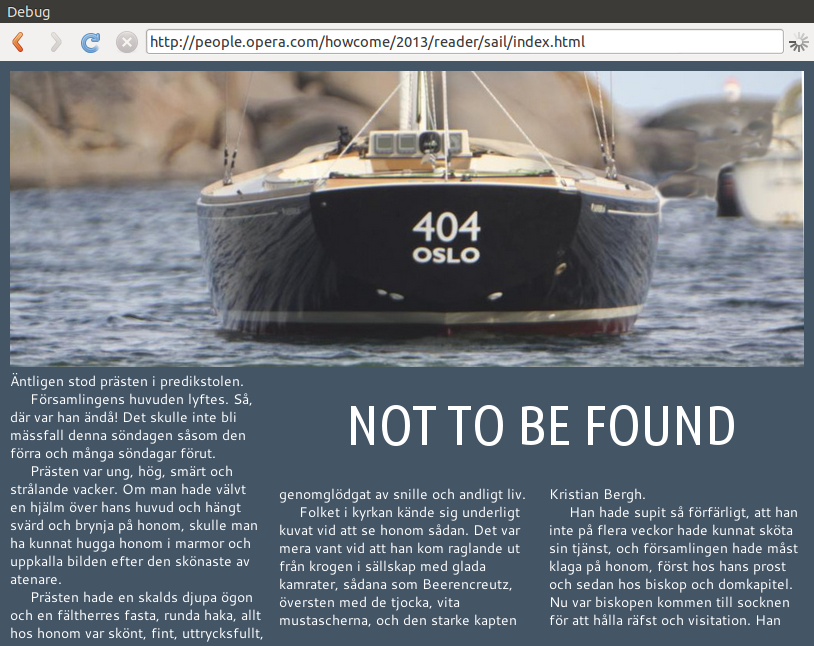
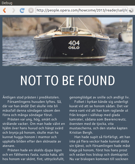
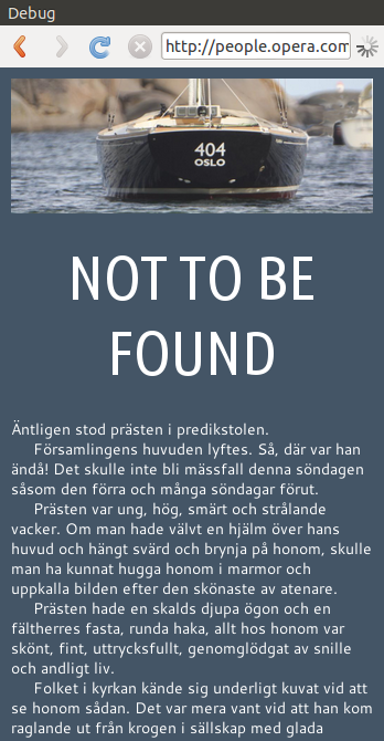
404
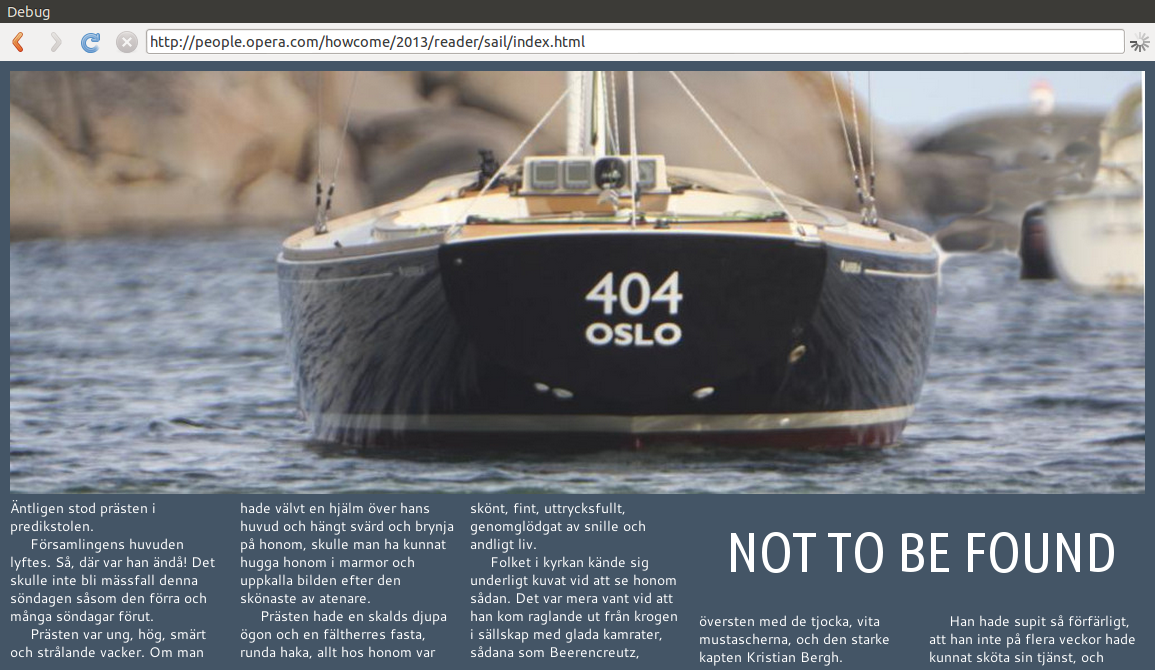
In the salty screenshots on the right, one image spans the full width of the screen. The headline spans two colums. When there is only one column left, the headline naturally only uses one column. Here's the code:
body { overflow: paged-x }
article { columns: 14em }
.fig { float: bottom; clear: column }
h1 { float: top-corner; column-span: 2 }
img#sail { column-span: all; float: top }
And here's the document.
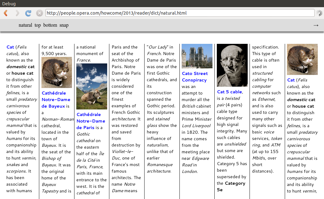
Dictionary
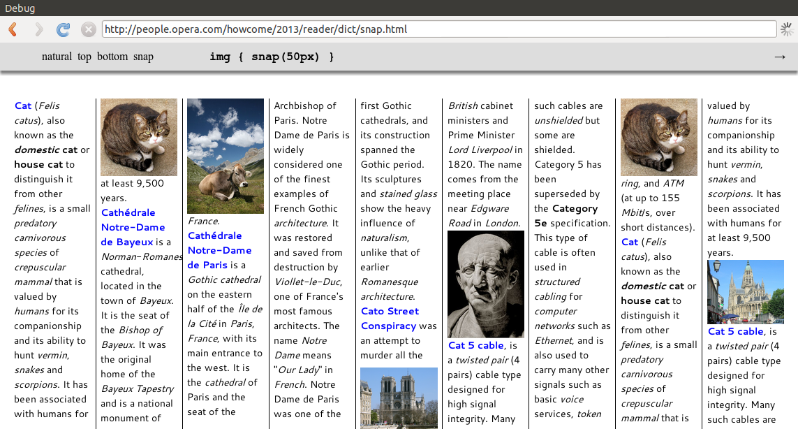
The screenshot on the right are from two different pages where images are either in their natural position, or where images are snapped to the nearest edge. The images are initially placed in their natural position in the flow. However, if the images end up being close to either the top or bottom edge, the image will snap to the edge. This way, one can avoid (a) white-space at the bottom of columns, and (b) widows/orhpans between images and edges. Here's the seminal code:
img { float: snap(100px, near); width: 100% }
The snap() function is described in GCPM.
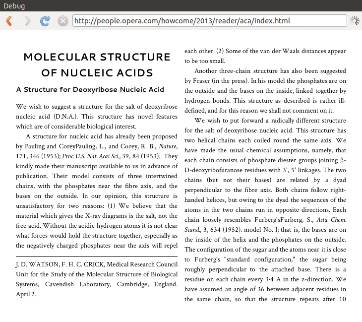
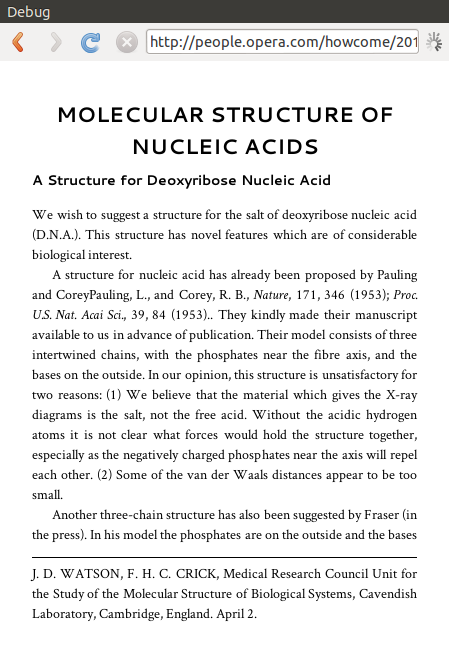
DNA
On this page, one page float contains the contact information for Watson and Crick. It it floated to the lower left corner in a two-column layout, and at the bottom of the one-column layout. Here's the seminal code:
.note { float: bottom; border-top: thin solid black; margin: 0.3em 0 0; padding: 0.4em 0 1em }
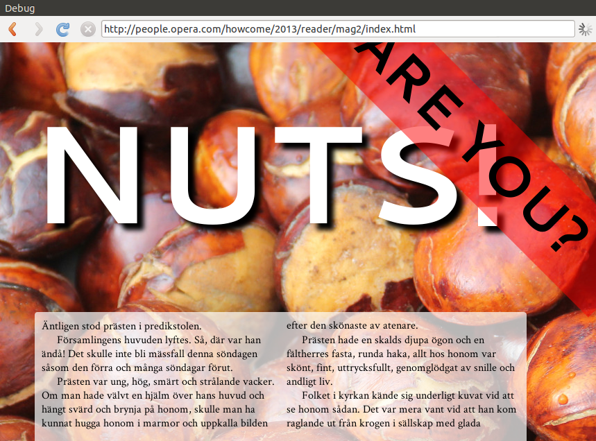
Magazines go nuts
A background image on a this page suddenly makes it look like a magazine.
Håkon Wium Lie
haakon@wiumlie.no
2012-02-13-
