CSS Regions, still harmful?
In a recent article on A List Apart, I argued that CSS Regions would be harmful to the web. As evidence, I pointed to a tutorial on CSS Regions that exposes several problems: dummy DIVs, unresponsive design, verbose code, and lack of code reuse.
There has been a healthy debate about CSS Regions in the wake of my article. Some people have acknowledged that CSS Regions can cause problems when used wrongly, but claim that — when used the right way — they will be positive contribution to the web. Flippinawsome has two articles that defend CSS Regions and give code examples which, supposedly, show how to use Regions the right way. I like code examples and I've spent some time analyzing. This is what I found.
Responsive?
One article, by Brian Rinaldi called Using CSS Regions in Responsive Designs, is written to show how regions can be used to create responsive pages. The Robots Weekly example is a compelling page where the top half is a single column done without CSS Regions, and the bottom half uses CSS Regions to display the content in 1-3 columns:

As can be seen from the figure above, the document will start off with three columns on an average PC screen. The number of columns will be reduced as the screen narrows, ending up with a single column. Thus, the document responds to the user's environment, and proves that CSS Regions are responsive? Before concluding on this matter, one should look at the underlying code. Let's start with the HTML code for the three columns:
  <div id="region1" class="region"></div>
  <div id="region2" class="region"></div>
  <div id="region3" class="region"></div>
As can be seen, these elements are dummy elements that do not contain any content; they are only there for presentational purposes. Indeed, introducing presentational HTML elements is my primary complaint about CSS Region. But responsiveness is also high on the list, so let us see how the author constructs columns using CSS Regions. Here is the CSS code:
.region {
   flow-from: article-content;
   width: 30%;
   height: 550px;
   float: left;
}
In the above code, each region is initially given a width and a height and is floated to the left. The width is 30%, which reflects that the author wants three columns initially. The height is not so easy to understand. Why 550px? How did that number come about? It turns out that 550px is, roughly, the height of the columns when the content of the article element is poured in. The only way to find that height is to know what the content is, what the font size is, and all the other parameters that influence the presentation. This is something that the author, or an authoring tool, can guess, but if the content changes (for example, when the text is translated) or the user changes the font size, the guess may fail. So, this style sheet is tied to a specific article and cannot easily be reused. This was also on my list of complaints (#5).
Returning to responsiveness, let us find out how the number of columns are reduced when the window narrows. Here is the code that applies:
@media screen and (max-width:695px) {
  .region { width: 46%; margin-left: 3% }
  #region3 { display: none }
  #region1 { height: 750px }
  #region2 { height: auto }
}
In prose, this means «when the window width is smaller than 695px, reduce the number of columns to two by setting the width of the first two regions to 46% and deleting the third region. Also, limit the height of the first column to 750px, and make the second column grow as tall as it wants».
Again, one can easily understand why the width is set to 46% (there will be two columns), but the height (750px) depends on the content of the article. A similar code snippet reduces the number of articles to one when the window becomes very narrow. So, the author has provided three different presentations that are switched between using media queries.
In conclusion, the sample page is responsive, but it's not CSS regions that provide responsiveness; rather, media queries are used to switch between different region-based designs. That's ok. Media queries is a powerful technology that can be used to make just about any page responsive, but it comes at a price; using media queries leads to having to provide several designs which often result in verbose style sheets.
The Robots Weekly sample is an attempt to use Regions to create multi-column designs. Instead of trying to use Regions for this purpose, I advocate the use of CSS multi-column layout, which results in just a few lines of CSS:
article {
  margin: 1em auto;
  font: 14px sans-serif;
  max-width: 800px;
  columns: 14em;
}
You can try my code here. My code is more compact (by a magnitude) and reusable (it doesn't have to guess the height of columns). Most importantly, it doesn't use dummy DIV elements.
Semantic?
In another article, Sara Soueidan argues that CSS Regions Matter. In it, she provides an example that uses regions without having to use dummy DIV elements. Let's see how that happens.
The desired layout on narrow screens is for articles to be followed by ads:
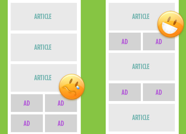
The author achieves this by creating a region after each article and then pouring ads into the regions. Here is the regions code in action, and here's the crucial CSS code:
article::after {
  display: block;
  flow-from: ads;
  height: 5em;
  margin: 1em 0;
}
Instead of using DIV elements to represent regions, the author uses CSS pseudo-elements. Pseudo-elements behave like real elements in many ways and they accept CSS declaration with properties/values. To get ads into the element, the flow-from property is used. The height property is used to limit the height of the region.
On the face of it, this approach makes sense. You'd like for ads to appear after articles, so you create a region after each article and pour advertisements into these regions. No HTML elements are harmed in the process. If CSS Regions are like the Soviet regime, this example is like the 1980 Olympics; even harmful systems can create something worth watching.
But, does it scale? Is the method usable for all the other things people try using CSS Regions for?
First, let us consider the height constraint. The author sets the height of the region to limit its height. If the height is not constrained, the first region will contain all advertisements. By setting the height, one gains the distribution of ads, but one loses code reuse; if the are not enough ads, there will be areas of white space on the screen. (This issue can probably be addressed by using max-height instead of height, or by setting region breaks on the ads (although I couldn't make that work).)
Second, the number of times you have sensible, semantic HTML elements to attach regions to is limited. If you want to dazzle your audience with text that flows from one weird place to another weird place, you will quickly run out of pseudo-elements. This is what happens in the the author's other example:

In contrast, CSS Multi-column Layout automatically creates the number of boxes needed for the content and there is no need to. And if you insist on having weirdly shaped columns, you can make the text wrap around inserted shapes. (Although, personally, I'd probably leave some of the more esoteric examples to to SVG. Like Boustrophedon, or Alice in Wonderland.) And CSS floats can be used to move ads from the side to below articles, here's an example that works in all browsers.
Still harmful?
I appreciate the efforts that have gone into trying to use CSS Regions in responsive, semantic ways. The authors have shown that not all designs have to suffer from all the problems with CSS Regions, all the time. However, there are still plenty of problems left, even in the best-efforts examples provided. So, I still have to conclude that CSS Regions will be harmful to the Web.